Color Contrast and Readability on Real Screens
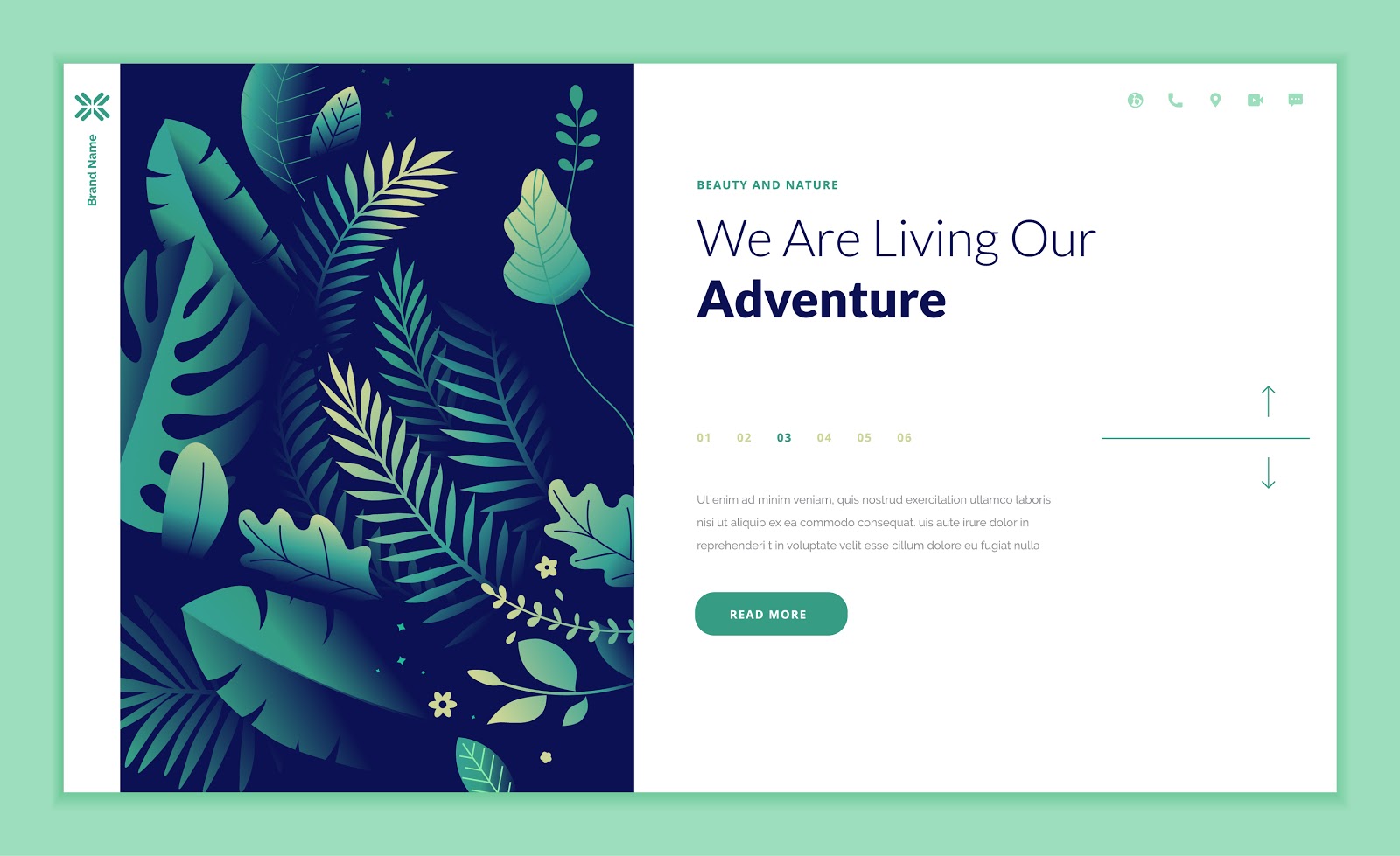
The most common readability failure on modern sites is not font size, it is contrast. Light gray body text on white became a design convention because it looks calm on a high-quality monitor in a dim room. Most of your visitors are not in that room.
The numbers
Contrast ratio compares the luminance of text against its background, from 1:1 (invisible) to 21:1 (black on white). The working standard is 4.5:1 for body text and 3:1 for large text and interface elements. Any browser's developer tools will tell you the ratio for a given element, and there are free checkers where you paste two color values.
Where sites usually fail
- Gray body text around #999 on white, which lands near 2.8:1.
- Placeholder text in form fields, often the lightest text on the page, and the text people most need to read while typing.
- Text over photographs, where contrast varies across the image. Use an overlay or a solid panel rather than hoping.
- Disabled and secondary buttons, which are frequently unreadable rather than merely de-emphasized.
- Brand colors used as text, particularly yellows, light greens, and mid-tone oranges.
Fixes that do not ruin the design
Darken body text to at least #595959 on white, which still reads as soft. Keep the light tone for large headings, where the threshold is lower. Use weight and size for hierarchy instead of lightness. And for brand colors that fail, use them for backgrounds, borders, and accents rather than for text.
Do not rely on color alone
Error states marked only in red, links distinguished only by color, and charts keyed only by hue are unreadable for a significant share of people. Add an icon, an underline, a label, or a pattern. This is a small change that removes an entire category of confusion.
The field test
Take your phone outside at midday, turn brightness down two notches, and read your own site. Whatever you cannot read easily is the list. That test finds more real problems in two minutes than an automated scan does in an hour.